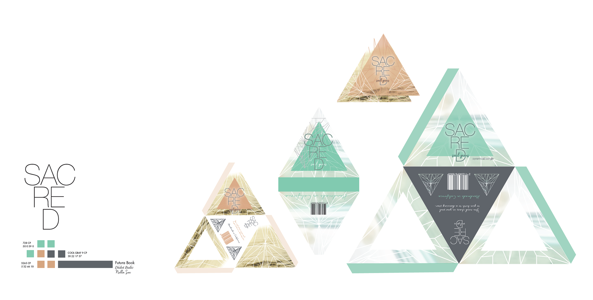
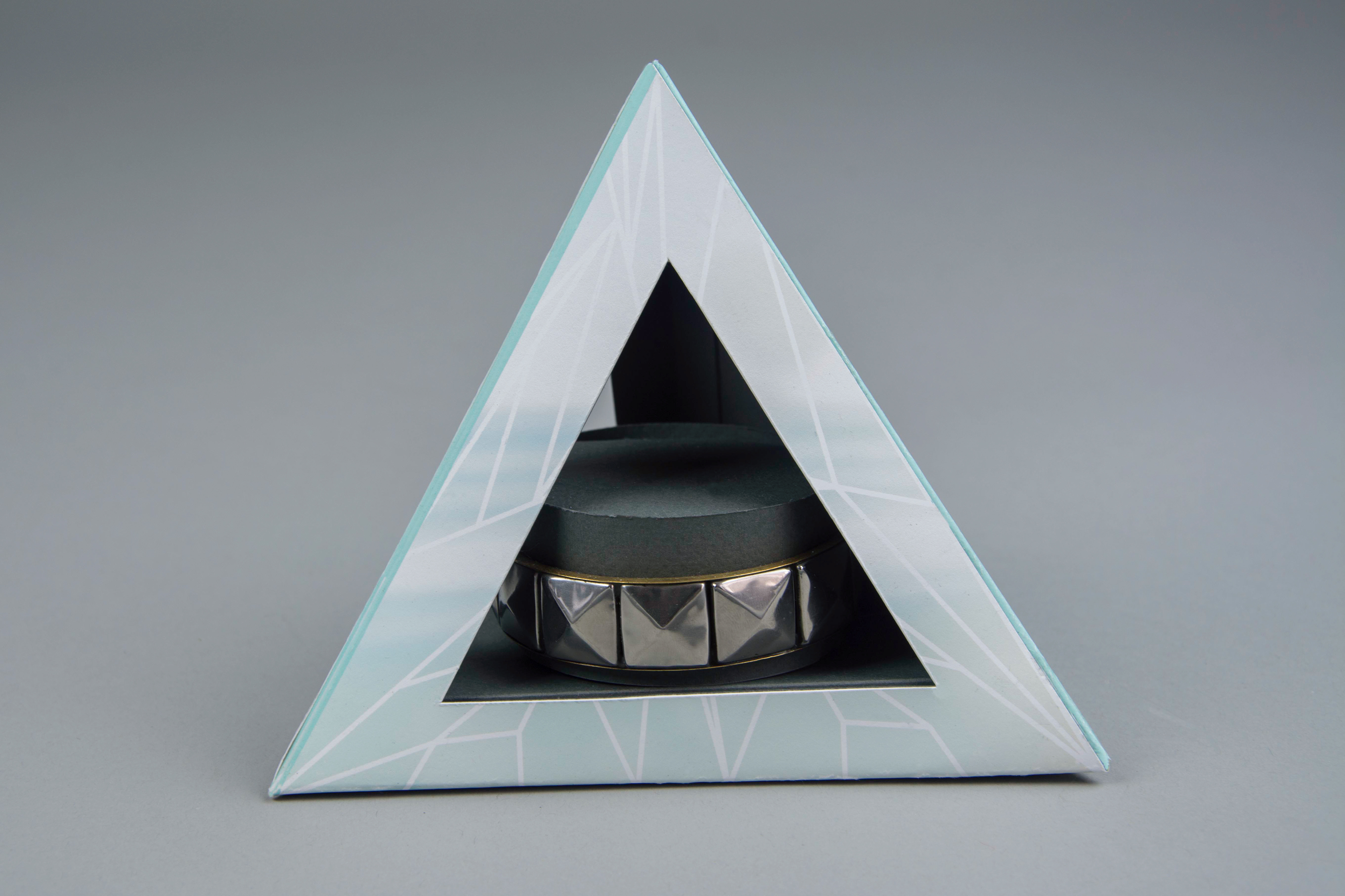
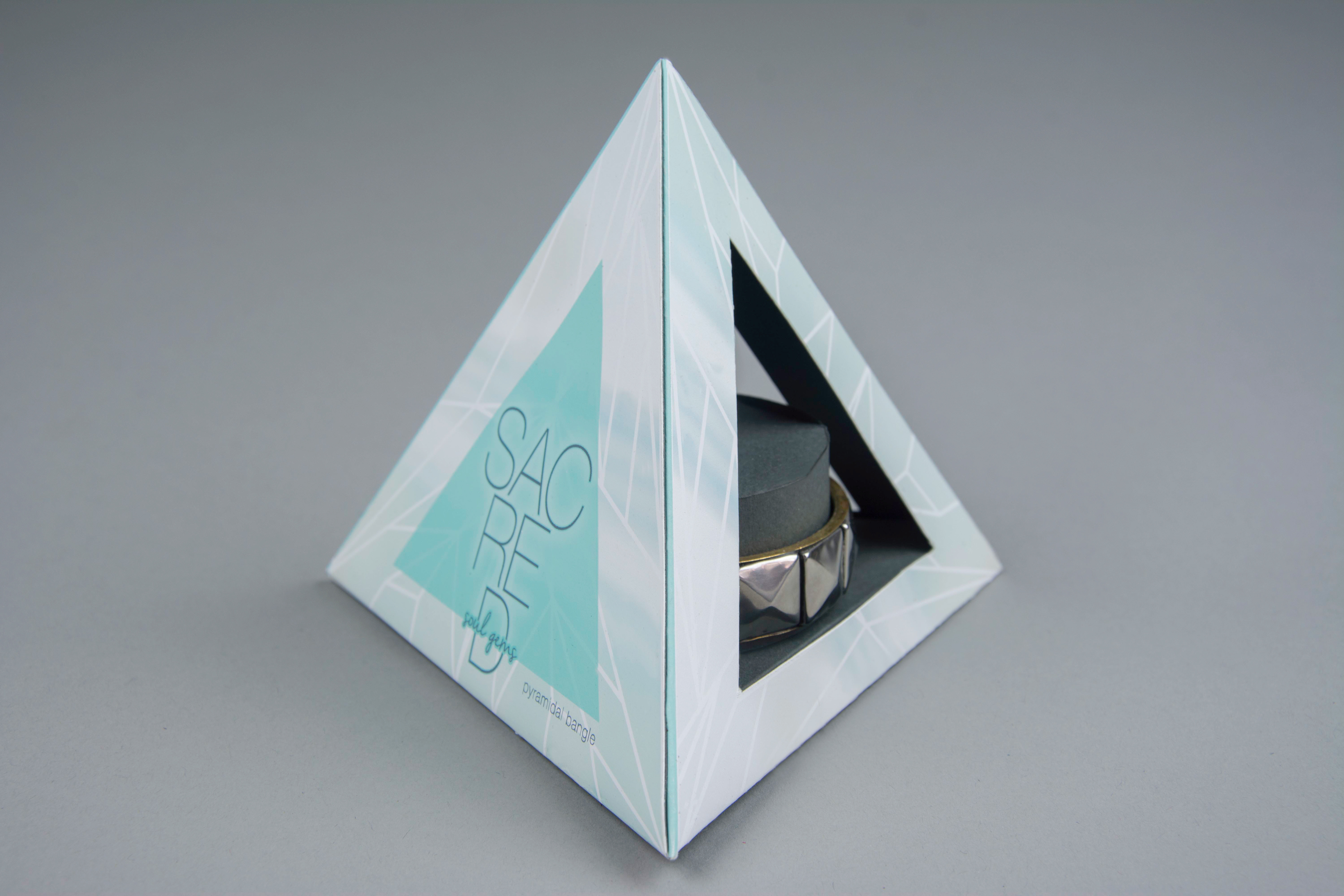
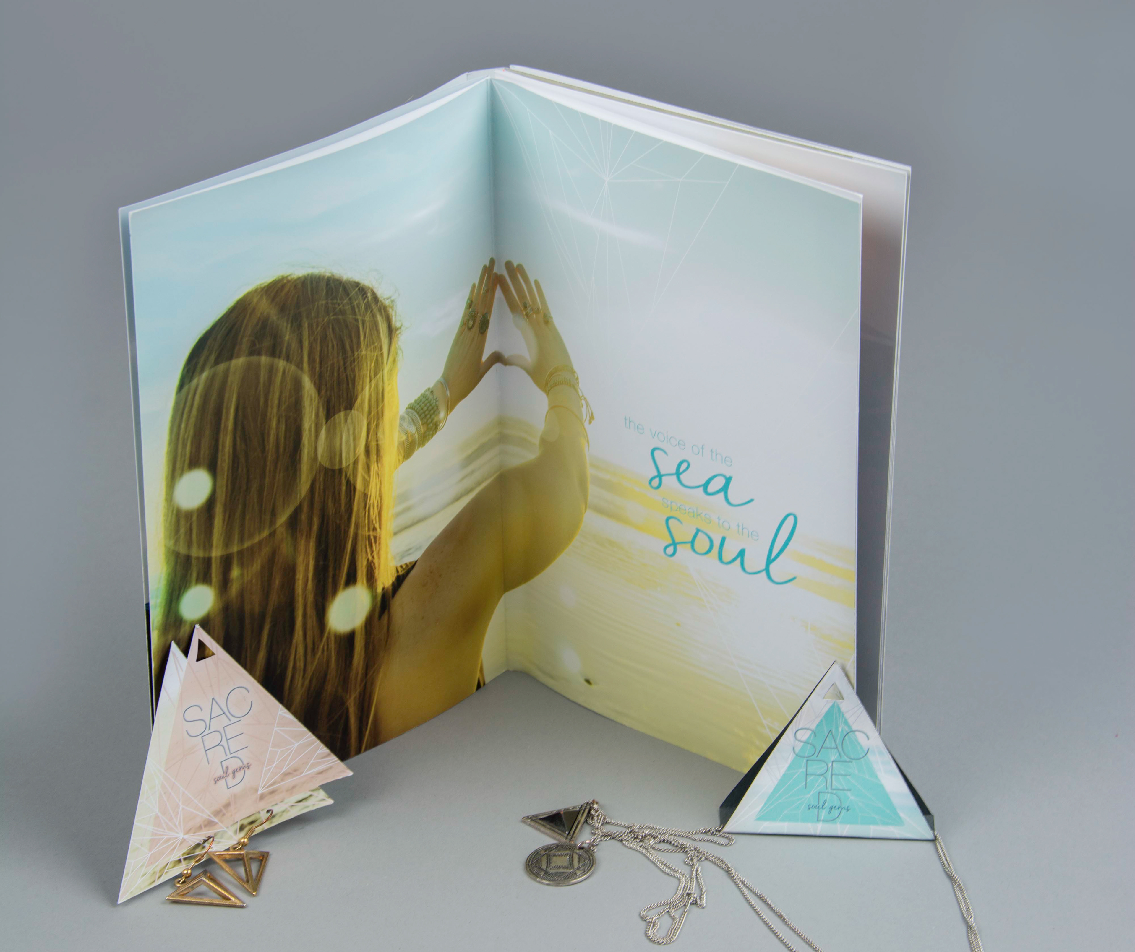
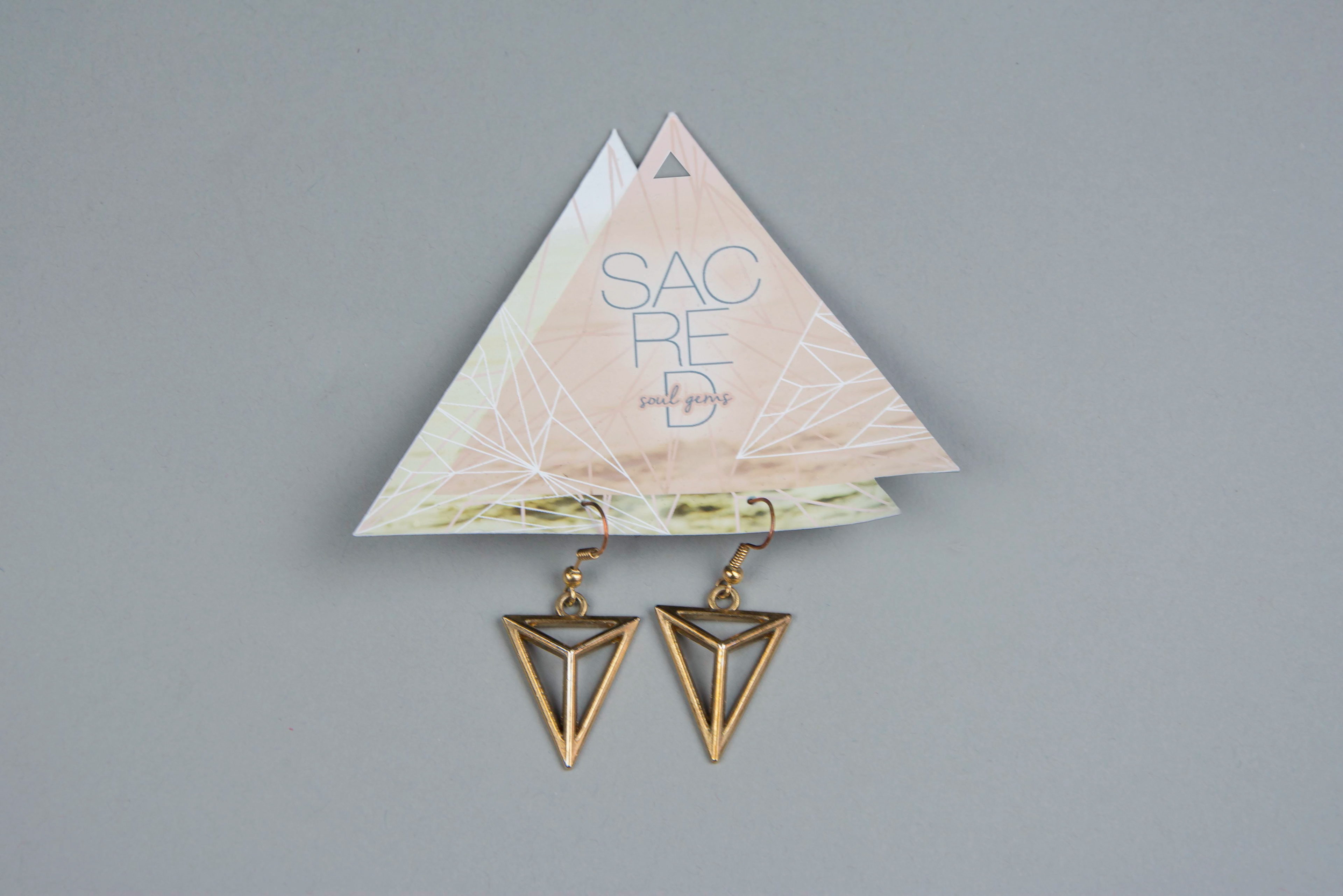
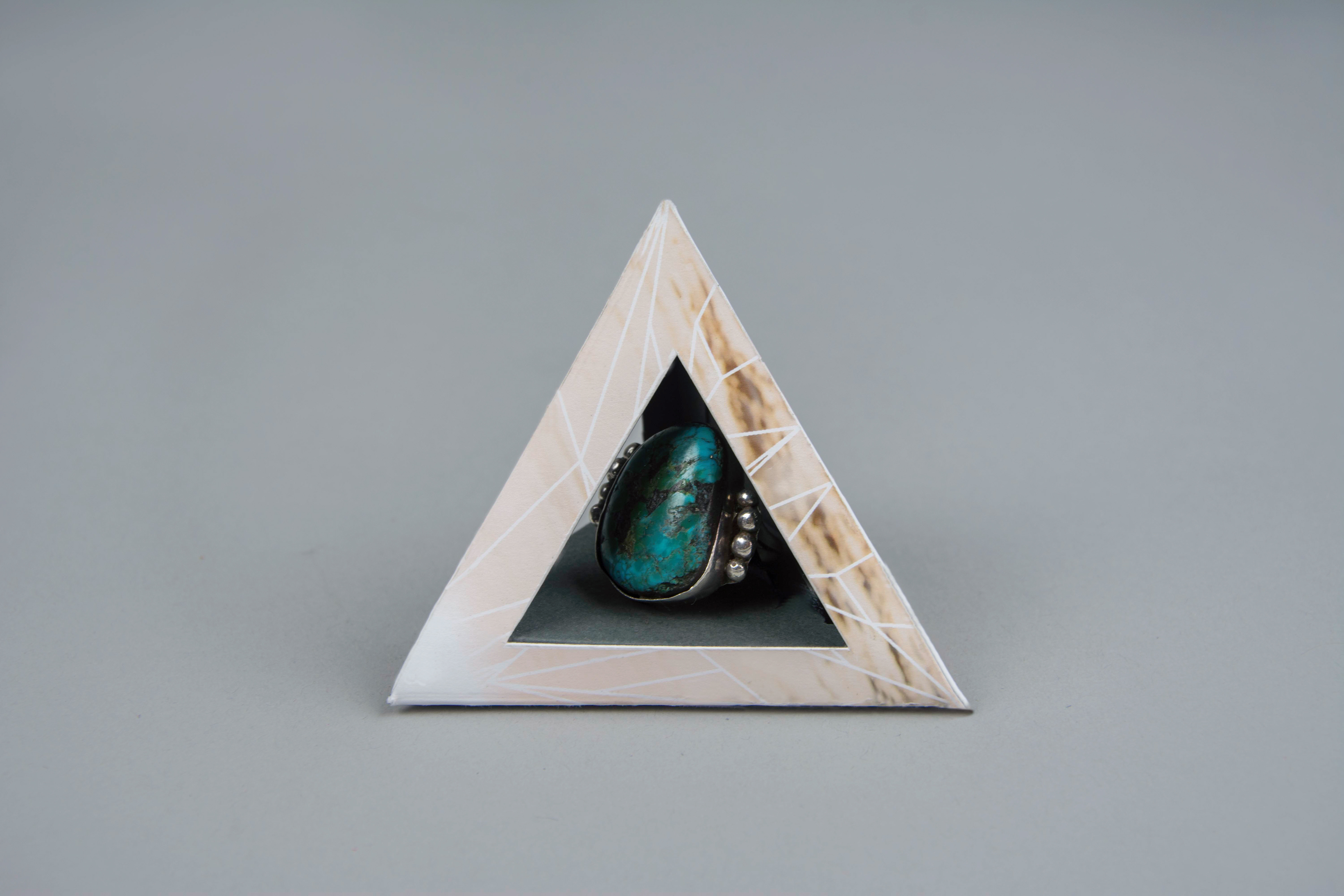
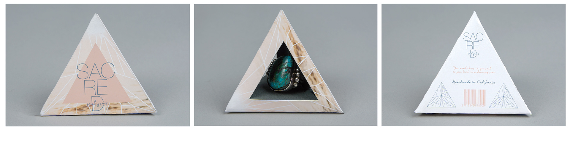
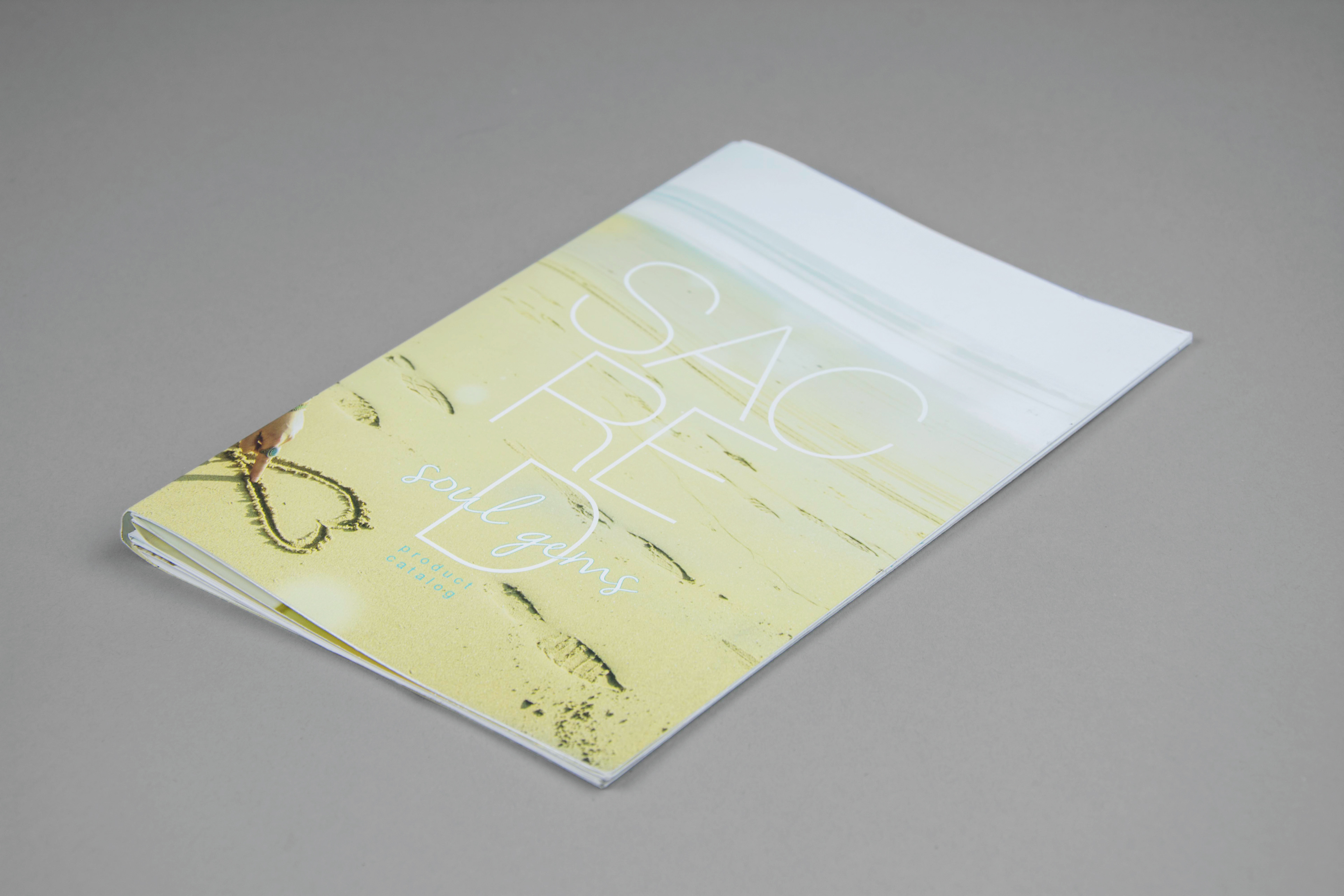
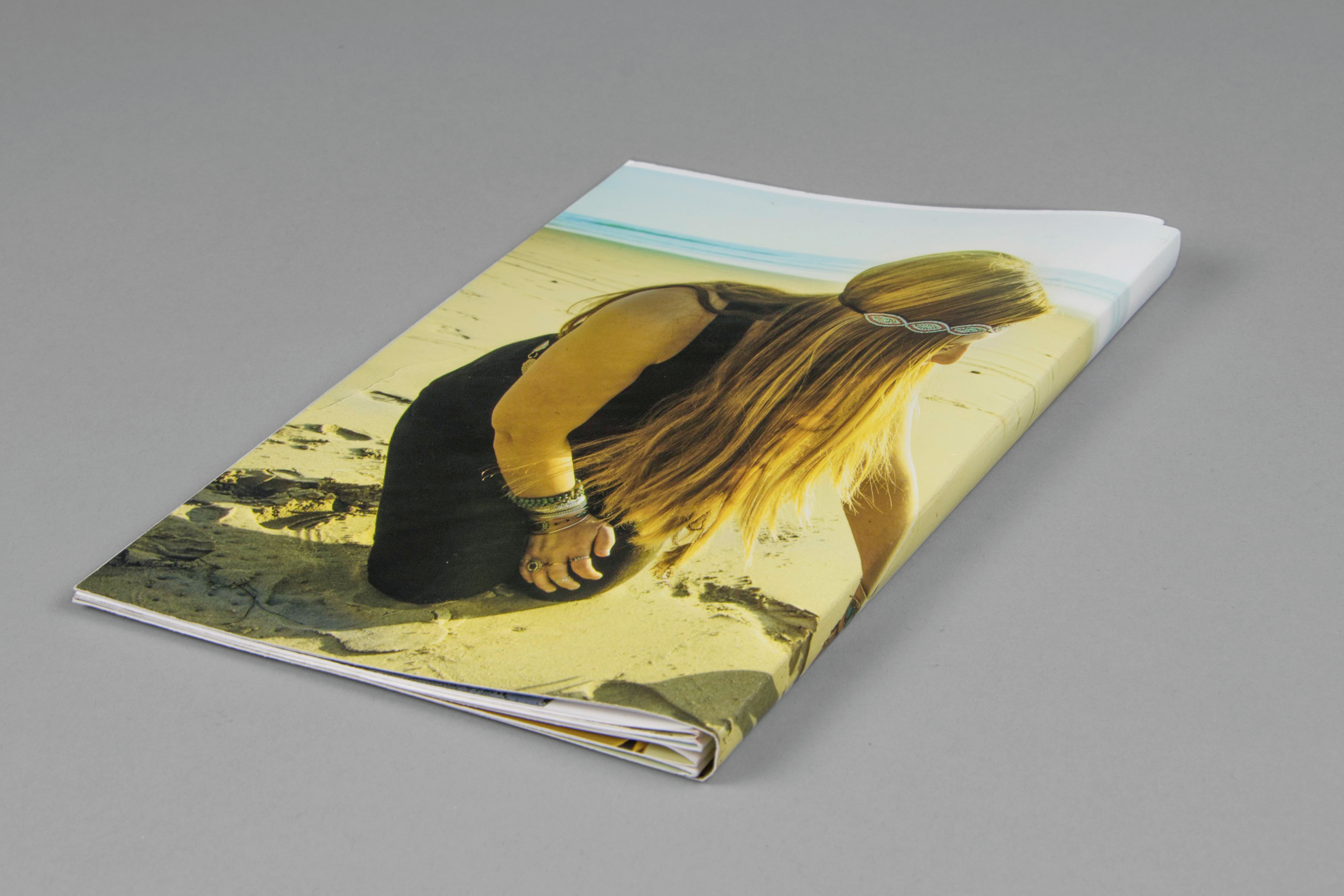
sacred
This project intends to appeal to a young feminine audience. The progressive packaging design stands out amongst competitors because of it’s innovative design composition and aesthetics. I chose to design the brand around a geometric shape, a triangle. I’ve used this shape because of it’s nature of being known as a sacred shape.